In the fall I will be teaching a section of Precalculus Honors at my school. I have not taught that course in about six years so I have not spent a bunch of time thinking about teaching trig functions for awhile. Our Precalc Honors class starts off with a study of Trig and I am thinking about an opening day activity that might plant a number of seeds that we will need to germinate over time. I want to play with some data that is periodic in nature and try to generate some hopefully interesting questions. Thinking along the lines of Dan Meyer’s challenge of finding an aspirin. I tweeted a bit about this and have been engaged in a terrific conversation with Bonnie Basu (@GotMathHelp) about a similar activity that I used as a demo lesson for a job interview years ago. The context is different since those students had already been a bit immersed in their study of trig but they had not been graphing yet. My goals with that group were to uncover the periodic nature of the hours of daylight, to talk about why other functions that seemed appropriate to the picture (especially quadratics) were not appropriate, to build up some sense of important vocabulary for trig graph analysis, and to simply plant some important ideas that would be explored in greater depth after I was gone. Looking back on the activity I see all sorts of tweaks I want to make and Bonnie has been super helpful in asking questions/making suggestions. Anyone who wants to take the time to share ideas or questions would certainly help make the beginning of my precalculus class this fall more meaningful and successful. I thank you in advance for any tips.
After another round of conversation on twitter that included tips from a student who just graduated from our school, I have been playing with three different data sets. I want to play with average daily temperature, high tide level, and with daylight hours. The data for the first two came from wunderground and the third data set came from dateandtime. Below are pictures of the data and Desmos links to the tables.
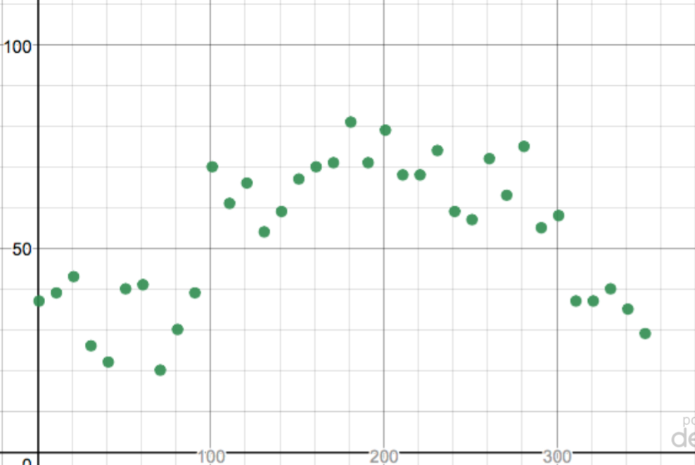
This picture (above) shows the average daily temperature in my town during 2017 at 10 day increments. You can see the Desmos table here. There are some things I like about this picture. I like the fact that the general shape can be inferred. We can talk about why it fluctuates on a number of different levels. However, I don’t think that this is a great data set for beginning to develop an idea of periodic functions. It feels too noisy to me.
Here is the picture for high tides.
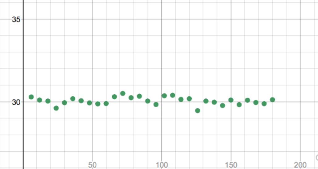
This table was built on data at 6 day intervals from the beginning of the year through June/July. You can see the Desmos link here. I would definitely ask the students to play with window sizing and I think that some powerful ideas about amplitude and vertical shift can quickly come out of such a conversation. I picked 6 day increments thinking that I would be slightly off phase with what I thought would be a period related to the full moon. A quick survey on google just talks about a 12 hour plus period so I may have been making this up in my mind. This picture feels more friendly with just a little noise involved. I might use this one early – maybe even on day one. The next one is much cleaner looking. Here is the data on length of daylight hours during 2017.
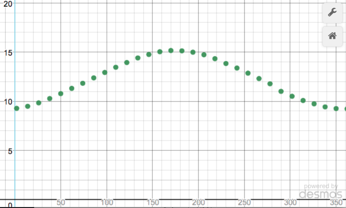
This is where my mind was when I created the demo lesson. However, this data is for our hometown here. You can see the Desmos link here. My thoughts about this data set go down two different paths. One thought is that this is clean and clear and easily explainable. One tweak I might make based on my conversation with Bonnie is that I might extend past one full year (say about 400 days or so) to make the periodicity visible not only intuitively meaningful. My second thought is that this might be too clean that it might lead my students into expecting such clean, clear periodicity in a messy world. I am probably overthinking this on the second train of thought.
I expect to have five table groups of students (groups of three in my classroom after long debating it, I accepted the wisdom shared by a number of MTBoS folks – especially Alex Overwijk (@AlexOverwijk) and my classes were better this year because of that change!) and I am thinking that each table group should have different data. I am playing with the idea of mixing up sunlight or tidal subsets of data versus simply subdividing one larger set. For example, if I go with the cleaner daylight data I can extend it to about 450 days or so and give different table groups subsets of about 35 data points each. I feel that they would benefit from seeing how the data ‘fits together’ and that individual table group decisions about amplitude, vertical shift, and period all match each other pretty well.
I would love some feedback/suggestions/questions and I thank Bonnie again for her valuable thoughts. You can drop comments here or over on twitter where I am @mrdardy