In my two morning classes today we tackled the problem that I just blogged about (link here)
Some interesting observations first and then some questions that came from my learners.
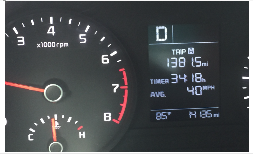
When data is not presented as a table, there is a distinct extra layer of processing that has to happen. One student went straight to desmos to graph the points his group had. I liked that he wanted a visualization. A number of them, when I asked how to find the AROC between two pictures were flummoxed. Let me give you an example of what I saw from a number of students. Look at the picture below:

A number of students divided 1381.5 by 34.18 (more on that in a moment) and arrived at 40.418 as an answer. This matched the given information but they did not seem to notice that this did not answer any part of my question about AROC from point A to point B, from point B to point C, or from point A to point C. [This conversation makes sense (I hope!) if you have read the first blog post that is linked above]
I had to poke to get them to recognize that any time we talk of an average rate of change, we are talking about more than one data point to consider. A number of them were happy to enter a time like 30:56 as 30.56. This disappointed me a bit. For smaller minute data points I can see the mistake a little more clearly. For something as close to a full hour as 56 minutes, the willingness to enter .56 seemed more clearly wrong.
Once we ironed out the fact that we need to see time and distance as coordinates of a data point, then the slope idea for AROC fell into place more comfortably. Before talking about my challenging final question, I want to share a few questions and observations from the classes.
A student asked about the clock on the dashboard. Does it still count when the car is sitting? When I am sleeping? Great question, the answer was no. It only moved when the car was moving.
Conversations came up about the geography of Florida where I was driving. They guessed that some snapshots were taken in city traffic, others after highway travel.
Discussions came up about why the average on the dash did not change even when intervals had different AROCs. I relied on a baseball analogy. Late in the year a 0.250 hitter might have a great day and go 3 for 4 while not changing his overall average at all. That seemed to make some sense to them.
The final question I asked was more difficult for them than I had anticipated. I asked each group to consider the following situation. How long would I have to travel at 60 MPH to raise the trip meter average velocity to 42? In my mind I simply wanted to use the last data point as the jumping off point and add an unknown time ti to the x value (the time input) while adding a distance of 60t to the y variable (the distance output.) This idea did not organically appear in class and I pushed a bit more than I wish I had as I saw our 45 minute time together elapsing. I am often comfortable with questions being unresolved at the end of a class period. However, with this question at this time of the year (this was only our fifth class together) I really wanted a conclusion to the mystery. I will definitely revisit this experiment as we work more deeply on our ideas of rates of change and I will remind them of this conversation on a number of occasions. An unexpected bonus idea that came through loud and clear was the MVT even though we don’t have a name for it or a formula describing it yet.
Pretty pleased, I must say.